
There’s a question that quietly haunts every artist who’s been around a while: Am I actually saying something, or am I just making things look nice?
Anthony Burrill, the graphic artist behind the famed Work Hard & Be Nice to People poster, has spent three decades wrestling with that tension. And most recently, the answer arrived in a 3×3 metre plywood structure on a festival site in Somerset.
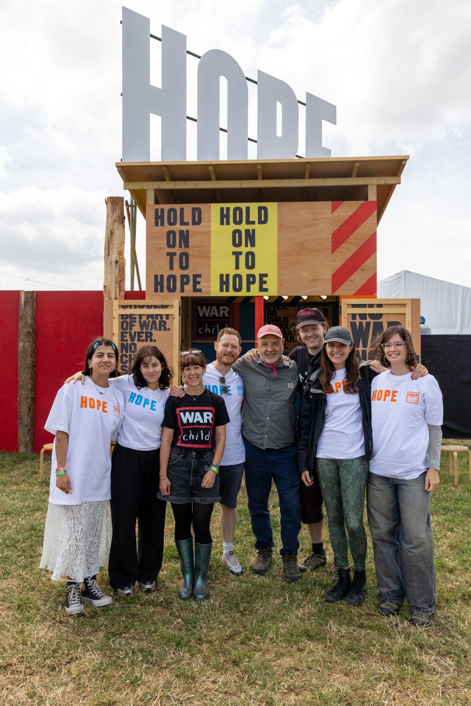
In a talk to members of our own private network, The Studio, Anthony took us behind the scenes of the War Child Pavilion at Glastonbury 2025. He’d worked with furniture and product designer Michael Marriott to design this bold installation for War Child, the charity that works to protect children whose lives have been torn apart by armed conflict.
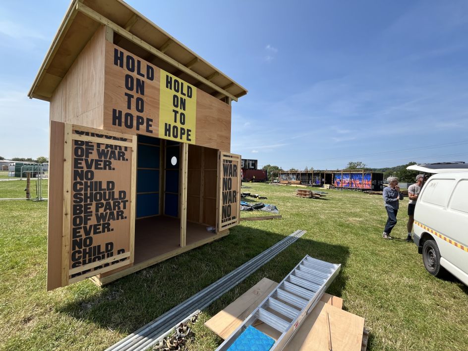
It was, by any reasonable measure, a logistical headache; built on almost no budget, assembled in a Bristol workshop as a flat-pack kit of parts, driven to the site, and erected in two days by a small team. Anthony slept in a tent. He loved every second of it.
A landmark made of letters
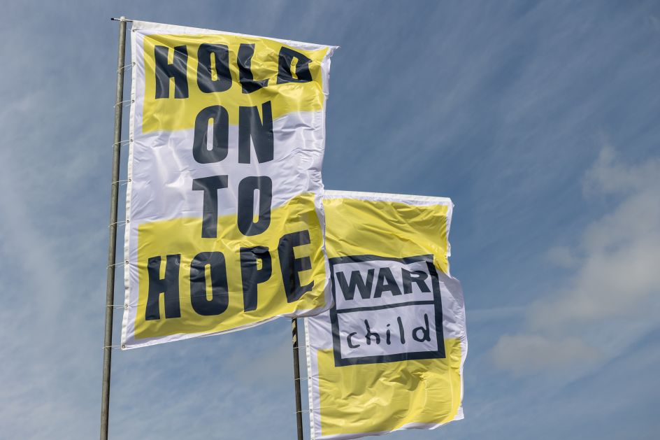
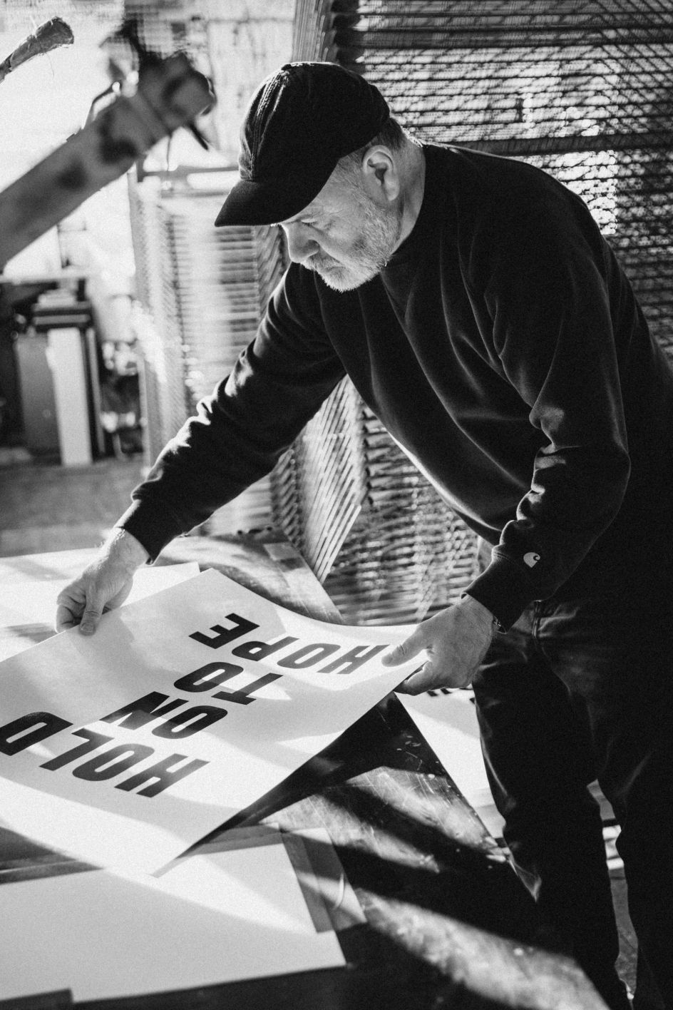
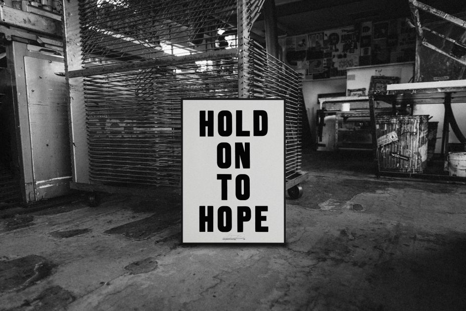
The pavilion sat in Silver Hayes, Glastonbury’s dedicated area for electronic music and DJs. It’s a heaving, bass-heavy corner of the festival that’s about as far from quiet contemplation as you can get. Rising above it were four giant letters spelling HOPE, visible over the heads of passing crowds and quickly adopted as a meeting point. Below them, a small building wrapped in Anthony’s signature woodblock typography and bold diagonal stripes carried the messages ‘Hold On To Hope’ and ‘No Child Should Be Part of War. Ever’.
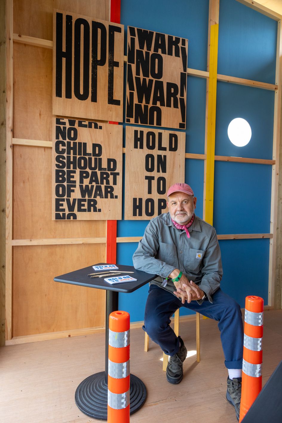
Inside, War Child volunteers invited festival-goers to write messages on postcards embedded with wildflower seeds. Afterwards, the cards were composted to create a meadow, turning thousands of scribbled hopes into something that would literally grow.
What made the project really sing, says Anthony, was the freedom. “When War Child work with artists, they let us use our full creativity,” he explains. “I didn’t have any brand guidelines to work with; the creative aspect was completely open. So I could really put my stamp on it.”
That absence of guidelines might make some creatives nervous. For Anthony, it was the whole point.
The long road to doing exactly what you want
Anthony’s career to date is a useful case study in creative patience. He studied graphic design at Leeds Poly, then completed an MA at the Royal College of Art in the early 1990s; an era he recalls fondly for its complete absence of computers. “Everything was handmade in those days,” he smiles. “Everything was analogue and scratchy. You’d use found objects, things we found on the street, and just use them to create work.”
After graduating, he spent years in commercial work before growing frustrated with the compromises it demanded. “I was at the mercy of an art director,” he recalls. “I’d send stuff in, then get feedback and have to change it. And slowly my vision would get watered down.” The solution, reached gradually, was to step away from that world entirely. “I just found it hard to compromise after a while, and get feedback from people whose opinion I didn’t value,” he says.
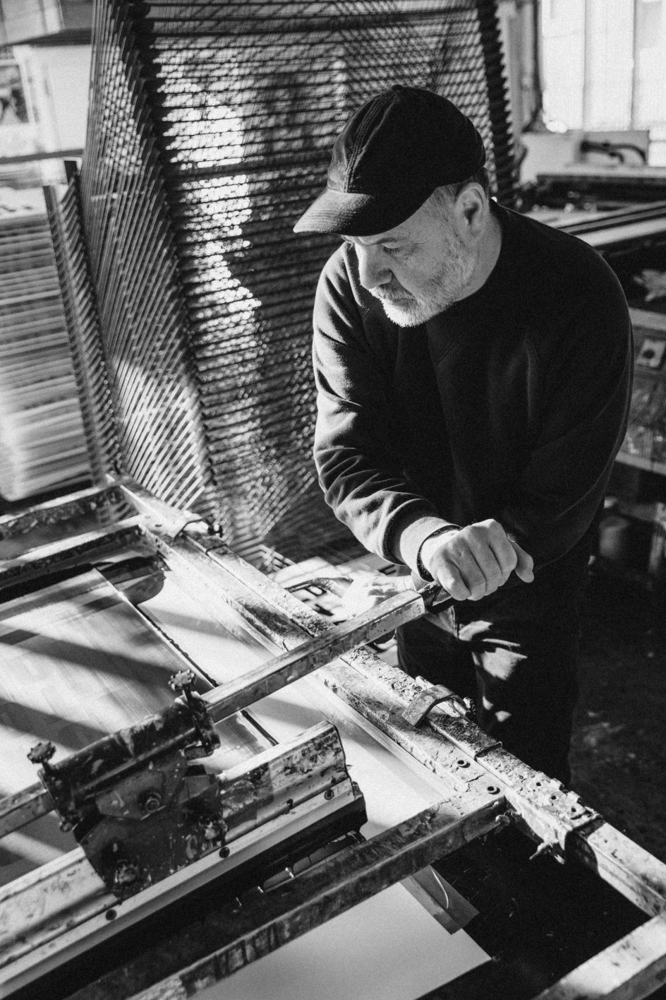
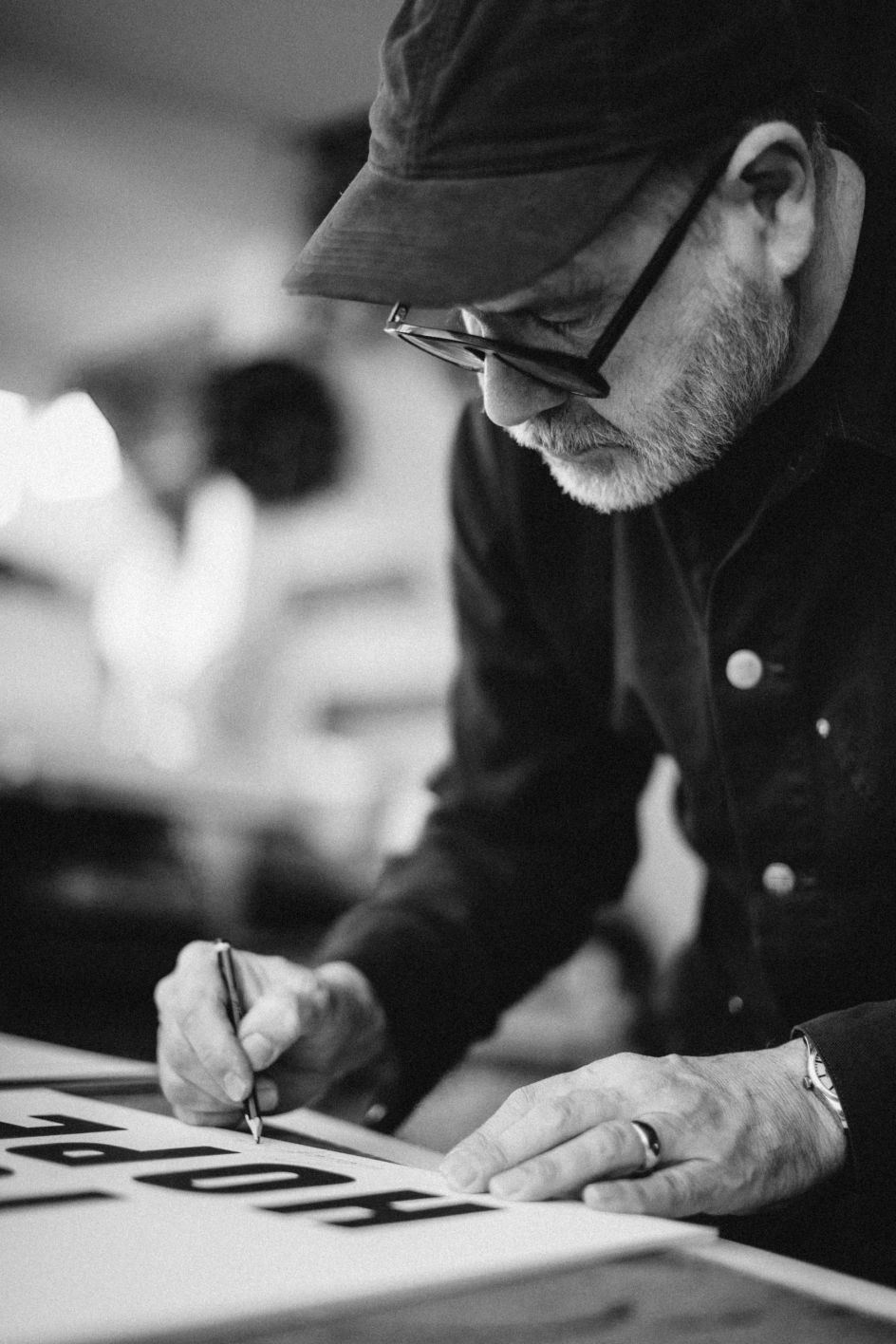
A move to East Sussex led him to Adams of Rye, a letterpress workshop where he began producing the bold, analogue poster prints that would define his practice. Working within the physical restrictions of a small collection of wood letter typefaces became a creative discipline in itself. “For me, it was about working within restrictions and being ingenious and inventive with the things I was working with,” he reflects.
That philosophy of ‘constraints as liberation’ underpinned the Glastonbury 2025 project too. Limited budget? Build a flat-pack. Tiny footprint? Make the letters enormous. No brand guidelines? Even better.
The right project beats the right fee
Asked by a Studio member how making the work for Glastonbury and War Child made him feel, Anthony is disarmingly honest. “It was kind of a dream come true,” he says. “To be part of the festival that I feel such a connection to, and to actually see it the week after with lots of people around it, interacting with it, was really gratifying.”
He’s been going to Glastonbury for years (“5am by the stone circle, talking about the meaning of life”), and that accumulated experience fed directly into the design. The pavilion’s interior even included a sly nod to the Haçienda, the legendary Manchester nightclub, with hazard stripes and colour references that felt right at home in Silver Hayes’ dance music territory. “We knew it was going to be in the dance bit of Glastonbury,” Anthony explains. “So we thought it’d be great to have that historic reference back to where it all began for a lot of people, myself included.”
When asked to name his favourite ever Glastonbury year, Anthony doesn’t hesitate. “Last year, when I was there with War Child,” he responds. “Because I felt like I was part of it and contributing to it.”
The case for making work that matters
Anthony’s broader message is characteristically direct. “I think it’s important for us as creatives to feel like we’re not just making work for commercial clients, but we’re making it for the common good,” he says. “I love visual communication and typography and graphics, but I think it’s even more powerful when it’s actually saying something.”
He’s realistic, of course, about what can be achieved. “A single poster isn’t going to change the world. But I think if it’s part of a consistent message that’s being communicated by lots of people, I think there’s a chance that we can make the world a better place.”
There’s a temptation to be cynical about that sort of statement, but Anthony has the receipts. His work sits in the permanent collections of the V&A, the Design Museum and the Cooper Hewitt. He’s printed protest posters with oil gathered from the Gulf of Mexico spill and charcoal from Australian wildfires. He made work for Extinction Rebellion that was carried out on the streets. And now he’s built structures at Glastonbury that double as fundraising hubs for children in conflict zones.
The lesson for creatives isn’t to work for free (though Anthony clearly considers the right project worth more than its invoice). It’s more than the work you choose to do, and the people you choose to do it with, that shape what your practice actually means. Or as the man himself might put it, in large wooden letters: hold on to hope.


