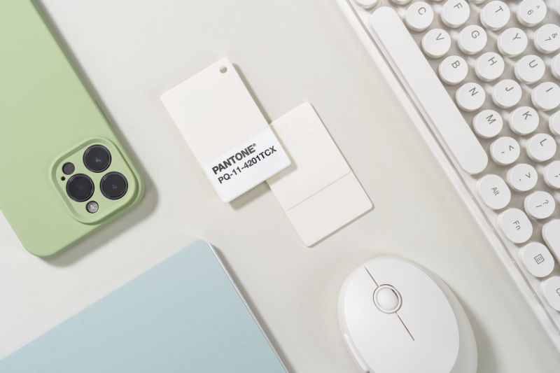
Pantone has announced its Colour of the Year for 2026: Cloud Dancer (that’s PANTONE 11-4201, if you prefer the official name). It’s a soft, aerated white that aims to feel less like a colour and more like a pause. It may be the perfect antidote to the current gloomy mood. Or it could be Pantone reading the room and recognising we’re all a tad burnt out from recent global events.
Whatever its purpose, it’s undoubtedly a clearing of space in a world that’s speeding up. Where this year’s Mocha Mousse hoped to soothe us with its warmth, Cloud Dancer moves us towards calm, acting as a quiet counterpoint to the overstimulation that defines so much of our modern lives. AI included.
Pantone calls it a “hue of clarity” – a shade that simplifies. “The cacophony that surrounds us has become overwhelming,” admits Leatrice Eiseman, executive director of the Pantone Color Institute. Cloud Dancer, she explains, is a way to step back from all that noise—a way to reclaim the inner voice that gets drowned out by the rush. Laurie Pressman, VP of the Institute, believes we’re living in a transitional time. “People are seeking truth, possibility and a new way of living,” she says, describing Cloud Dancer as a hue that sits between our digital futures and our primal need for connection. A liminal colour for a liminal moment. A launchpad for creativity as boundaries dissolve and new ways of making take shape.


To celebrate, Pantone is treating Cloud Dancer as a true blank canvas, commissioning artists to interpret the shade on their own terms. The first collaboration, with illustrator Emiliano Ponzi, takes the form of a limited-edition tote bag that mixes his sharp graphic language with the colour’s airy stillness. It marks the beginning of a broader initiative running throughout 2026, spotlighting creativity across disciplines and giving the community space to experiment and play.
As always, the colour is already causing a stir beyond today’s announcement. Motorola has featured Cloud Dancer in a special-edition Motorola Edge 70, wrapped in quilted vegan leather and adorned with Swarovski detailing. Play-Doh has reimagined its modelling compound in Cloud Dancer to mark 70 years of shaping little imaginations, framing the shade as a tool for quieter, more intentional play.
Post-it Brand is bringing Cloud Dancer into a new Neutrality Collection arriving in spring. Pura has translated the hue into a fragrance meant to capture its airy serenity. Spotify has put together a curated playlist inspired by Cloud Dancer – the first of its kind.


Mandarin Oriental is introducing Cloud Dancer touches into its hotels, from spa experiences to whimsical seasonal installations. Joybird, meanwhile, is developing tactile fabrics and furniture silhouettes that echo the calm hue.
For creatives, Cloud Dancer sparks a broader conversation about simplicity. As we all know, 2025 has been a challenging year for many in the industry, especially freelancers and studio owners who’ve weathered uncertainty, shifting budgets, and the constant change. A structural white like Cloud Dancer feels timely. It’s not flashy or in-your-face. It feels supportive and steady. Well, that’s my take on it.
It certainly opens up the floor for a 2026 full of creativity, acting as a versatile base that lets other colours shine. Yet it’s expressive enough on its own to anchor fashion, interiors, beauty, packaging, and digital design. In clothing, it slips easily between soft, cocooning silhouettes and floaty chiffons. In beauty, it offers a clean, modern base for any creative look. In interiors, it’s all about creating rooms that breathe again. And in branding, the minimalist white is the kind that allows our work to make an impact without shouting over the constant noise.


Cloud Dancer arrives at a moment when many of us are craving peace and the chance to think clearly again. It’s not a colour that demands attention; it’s more of a subtle invitation. If you think about it, Pantone might be nudging the creative world back to the beginning, i.e. the blank page. Because if we can start afresh after enjoying a little quiet time, then who knows what next year will bring?


