If you ever make it to Singapore, ArtScience Museum is well worth a stop. Sitting at Marina Bay Sands, it’s famous for its lotus-shaped building and for hosting exhibitions that bring together the best of art, science, culture and technology.
Since opening its doors in 2011, the venue has staged world-class exhibitions spanning a remarkable breadth, from legendary artists such as Leonardo da Vinci and Salvador Dalí, to immersive exhibitions by the likes of TeamLab, to the frontiers of big data, particle physics, paleontology and the mysteries of space exploration.
With its 15th anniversary as one of Singapore’s most important cultural institutions fast-approaching, it’s now reintroducing itself with a brand-new identity. Timed to coincide with a major exhibition called Another World Is Possible, the rebrand is more than cosmetic. It’s a statement about the role museums can play in shaping the future.
More than a facelift
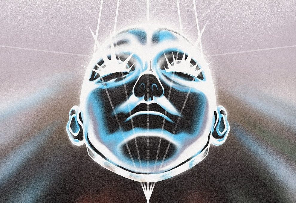
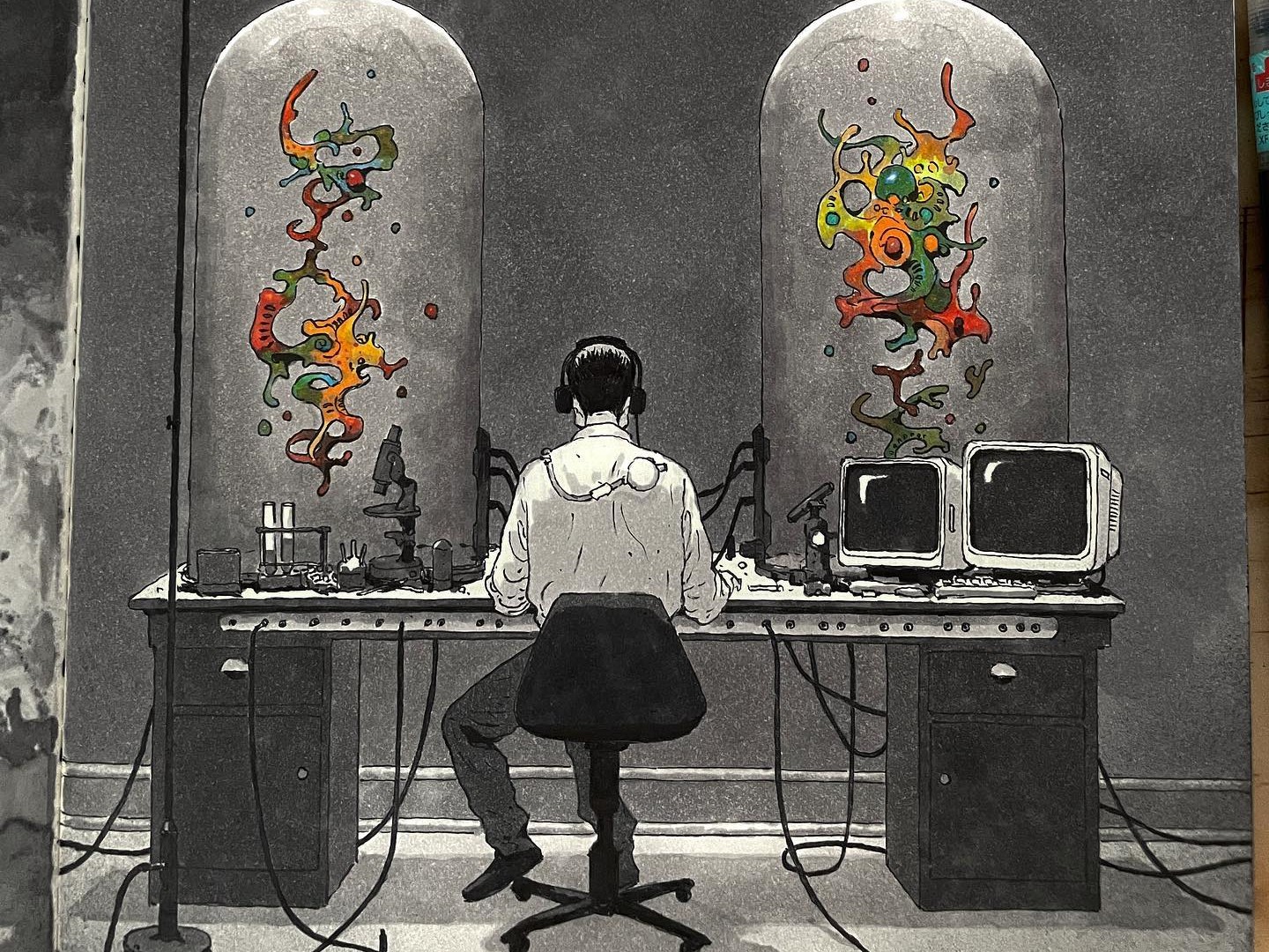
The rebrand is built on the principle of convergence: the idea that the most innovative thinking happens when different disciplines come together. This concept has fundamentally shaped the design language of the overall brand world, creating a visual system that embodies fusion and collaboration.


The creative work, developed by Project 3 Agency, manages to be both consistent and flexible, so it can stretch across very different touchpoints without losing its thread. That’s something many museums struggle to pull off, but it’s managed it brilliantly here.
“As a place where art, science, technology and culture intersect, it was imperative that the refreshed ArtScience Museum brand embody a sense of ideas coming together and creating space for new and innovative forms of artistic practice, research, community and culture,” explains Greg Stogdon, creative at Project 3 Agency.
Core elements include ArtScience Artex, an adapted typeface by Optimo, which does a great job of balancing readability with distinctiveness and embodies the Museum’s future-focused outlook. There’s also a new, flexible colour palette, built on both core monochromes and dynamic converging palettes drawn from key exhibition visuals and artworks.

Mockup

Mockup
There’s a refreshed logo suite, featuring a simplified symbol and lock-ups that convey a bold and contemporary look. And everything adds up to a holistic visual system, extending across exhibition collaterals, merchandise, wayfinding, digital and motion graphics.
A living identity
Running until February, Another World Is Possible brings together artists and designers who imagine alternative futures. And that makes it the perfect showcase for the new identity.
Here, the principle of convergence isn’t just written on a wall somewhere; it’s experienced directly. Visitors wander through speculative design projects and futuristic architectural models that demonstrate how art, science and technology can come together to create something entirely new. The exhibition doesn’t just show off the new visual identity; it shows what convergence looks like in practice.
That focus goes beyond exhibitions, too. In 2025, the museum views itself not just as a gallery, but as a platform for broader conversations about our shared future. Its design language—built on convergence, intersection and collaboration—reflects that ambition.

“Our new visual identity takes the Museum’s founding spirit of bringing art and science together, giving it fresh expression for today,” says Honor Harger, vice president of ArtScience Museum. “At its heart lies the belief that bringing people together at the intersection of art and science opens powerful pathways to explore our shared future.”
Changing times
The rebrand arrives at a moment when museums everywhere are asking how to stay relevant. With AI expected to transform the creative industries and climate change prompting us to reassess our way of life, institutions are under pressure to do more than just put on shows.
ArtScience Museum’s answer is to double down on what makes it different: using convergence as both a curatorial philosophy and a design principle to imagine new futures. That’s how it’s managing to stay both a local favourite and a global draw.
For creatives, the bigger lesson is this: ambition and authenticity can go hand in hand. Sometimes the boldest move is not to reinvent yourself completely, but to sharpen and clarify what you already stand for through a unified design language.


Mockup
As Singapore heads towards its 60th anniversary, and the world faces a future full of challenges, ArtScience Museum’s refreshed brand highlights how cultural institutions can step up; by asking tough questions, imagining alternatives, and leading the way through the power of convergence.
Takeaways for creatives
So what are the lessons here for anyone working on brand or identity projects? Here are the takeaways that stand out to me personally.
Embrace convergence. Instead of keeping different elements separate, ArtScience Museum’s rebrand shows how bringing disciplines together creates something more powerful than the sum of its parts.
Keep things consistent. From the signage in the gallery to the digital platforms, the new design hangs together beautifully. It’s flexible enough to adapt to different shows, but still feels like one voice.
Make concepts visible. The museum’s big idea of convergence doesn’t just appear in the marketing copy; it’s built into the exhibitions and the visitor experience directly through a cohesive design language that reflects this principle.


